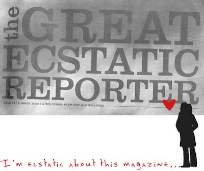
On a recent trip to Colorado, I came across a local, annual publication that piqued my interest. It's called the Great Ecstatic Reporter, and it's produced by a
bookstore/publishing non-profit out of Fort Collins- Wolverine Farms. Why do I think it's a good model for an exhibit on Sustainability? Let me count the ways...
A clear invitation to participate, with help provided. Sustainability is, after all, about all of us participating. The Letter from the Editors functions not only as an introduction to the issue, but also as an invitation to contribute. The part I like is that they offer help (which I'd gladly take advantage of) for submissions. So from page 1 they are inviting YOU to contribute:
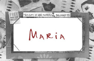
 They reinforce ownership/participation with a light touch.
 They include an Ex Libris page- a nice touch for a free, black and white newspaper piece. I like the invite
and the dichotomy.
 They talk about things of global import, through local color.
 This article below highlighted a local company that's developing solar power technology (click on it to read it). Another article talked about the author's visit to Amory Lovin's home- from his point of view.
 They walk the walk.
 They also pepper the magazine with "save" and "no expiration date" commentary, while using sustainable printing practices. Think the next issue will be on-line
and in print.
 They cover the bases.
 Take a look at their table of contents. It reads like an exhibit plan. At least, an exhibit I'd like to see (you may have to click on the image to see it larger):
 They include a call to action. In most articles, they include a call to action. Web sites, what you can do, invitations to participate, a variety of local resources to get involved with... the list goes on.
  They fully harness the nuanced power of design.
 As you can see from the images I've scanned above, they use the format of large image/ personal article to get and keep your attention. They utilize varied typefaces to further that aim. Most are along the lines of handwritten/scrawl to make it feel like "I can do this". It also gives it that handmade feel we're all so hungry for in our digital universe. Finally, I spoke briefly with the editor,
Tod Simmons. He said that they are a 501c3 and were a recipient of a grant for the printing of last year's GER by
New Belgium Brewery (a local brewing company that has deep philosophical and philanthropic roots). He said that they are always looking for different book or product reviews, local people or organizations, or "for shorter philosophical inquiries that look at living sustainably through a different lens". Love the result. Now I want to make an exhibit on it. Thanks, GER!

 On a recent trip to Colorado, I came across a local, annual publication that piqued my interest. It's called the Great Ecstatic Reporter, and it's produced by a bookstore/publishing non-profit out of Fort Collins- Wolverine Farms. Why do I think it's a good model for an exhibit on Sustainability? Let me count the ways... A clear invitation to participate, with help provided. Sustainability is, after all, about all of us participating. The Letter from the Editors functions not only as an introduction to the issue, but also as an invitation to contribute. The part I like is that they offer help (which I'd gladly take advantage of) for submissions. So from page 1 they are inviting YOU to contribute:
  They reinforce ownership/participation with a light touch. They include an Ex Libris page- a nice touch for a free, black and white newspaper piece. I like the invite and the dichotomy.
  They talk about things of global import, through local color. This article below highlighted a local company that's developing solar power technology (click on it to read it). Another article talked about the author's visit to Amory Lovin's home- from his point of view.
  They walk the walk. They also pepper the magazine with "save" and "no expiration date" commentary, while using sustainable printing practices. Think the next issue will be on-line and in print.
  They cover the bases. Take a look at their table of contents. It reads like an exhibit plan. At least, an exhibit I'd like to see (you may have to click on the image to see it larger):
  They include a call to action. In most articles, they include a call to action. Web sites, what you can do, invitations to participate, a variety of local resources to get involved with... the list goes on.
  They fully harness the nuanced power of design. As you can see from the images I've scanned above, they use the format of large image/ personal article to get and keep your attention. They utilize varied typefaces to further that aim. Most are along the lines of handwritten/scrawl to make it feel like "I can do this". It also gives it that handmade feel we're all so hungry for in our digital universe. Finally, I spoke briefly with the editor, Tod Simmons. He said that they are a 501c3 and were a recipient of a grant for the printing of last year's GER by New Belgium Brewery (a local brewing company that has deep philosophical and philanthropic roots). He said that they are always looking for different book or product reviews, local people or organizations, or "for shorter philosophical inquiries that look at living sustainably through a different lens". Love the result. Now I want to make an exhibit on it. Thanks, GER!


No comments:
Post a Comment