Monday, November 30, 2009

Night Owl Lessons


By Maria Mortati

Quasi-confession: I've been tinkering with exhibits in my spare time.

At Gyroscope we excel at long-term planning. By day, I'm involved in researching, development, and advising people. As a result I'm constantly being exposed to new ideas and movements. Sometimes I want to test them out- how easy or hard is it to do this? Is it feasible? Over time I've been developing small exhibits to get instant feedback. I’ve put furniture into an art gallery, prototypes at a fair, and a "museum" into a park (some of these projects were collaborations).

One of the things I have found so far is that the complete lack of context fosters impact. I put exhibits (more or less) in the "visitors" environment, so their natural curiosity gets them to engage. It also means that the "visitors" are more dependent upon graphics to help them make sense of what they are encountering. They are working harder to get the to why is this here? What is the story? Why are these things together? Having an answer that is clear, yet not simple-minded has been effective. Whether that is written by me or in the first-person voice of the “maker” doesn’t matter.

These non-museum museum-goers are happy that these exhibits came to them, they didn't have to pay, or schlep their kids in the strollers and park their cars. They are excited to be given the chance to experience something "cultural" unexpectedly, and let me know.

With good cause, we spend years developing museums & exhibits. However, it’s fun to just build something and try it out. It may or may not "succeed"... but you'll always learn something you can apply in the long haul.

My Christmas Wish List


by Scott Mouton, LEED AP

Lyn Wood the president of  Hands On! contacted us here at Gyroscope to be a part of an article on the complexities of green design. I am hoping that this  conversation grows and that through it we can better understand the role, responsibilities and opportunities we have as designers.  

Over the course of our talk I realized that what was emerging for me was a wish list of of tools for communicating with with clients and visitors on the subject. So in the spirit of my son's Christmas wish list, this is what I'd like:
  • An easy way to describe what criteria is being using to make design decisions (There are so many flavors of green and we don't know how to describe them)
  • A way to frame our work as doing good rather than doing less bad.
  • A way to quantify the impact of some of our decisions.
  • A way for clients and visitors to understand the complexity but still be able to hold onto something as simple as "Green Design".
Over the next few weeks I'll be working through my thoughts on this. I would love to hear your ideas on what you think would help this conversation on "Green Design".

Image courtesy Library of Congresss, via Flickr.

Wednesday, November 18, 2009

We've Got the Beat (or Why Percussion Makes for a Good Music Exhibit)


By Maria Mortati, Sr. Exhibit Developer

In the last month I have visited 19 museums. Some have had sound or listening experiences- an exhibit content area we're working on. One thing we've been looking at is how to help people fairly quickly make and share music. There are lots of approaches, from acoustic to technical, and as a part of our research, we've been trying them all.

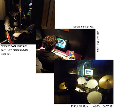
On a recent visit to the Experience Music Project my experience was a bit like the 3 Little Bears. I tried several instrument booths until I found the right one- or rather, the best experience. 

The guitar was cool, but to follow along for a real lesson where I'd actually learn something, I'd need a couple of hours... or days. Plus my feet were getting tired (am old!). The keyboard was better- I was sitting, the experience was more isolated, and it was easy to strike a note and know I'd gotten it "right". However, it sounded... not so good. Drums however were just right: I was seated, the sound was easy to make, there was little "right or wrong" and the on-screen lesson synched with the booth experience worked well to make me sound good.

Not long after the EMP trip, I was with a group at Zeum where everyone walked up and started jamming together on some tubes for their "Pop Music" experience. They played, the got it, and they had fun– all in the space of a few minutes:


On a visit to the Exploratorium Listen exhibit, they have lots of fun, phenomena-based exhibits. However, the creative exhibits which required "playing" or making sound were primarily percussive. There was the 'Xylophone Room' exhibit, and of course, the drums. While both weren't social, they were both engaging and fostered instant mastery.


It's an interesting challenge to get the general public excited about music-making, have a sense of appreciation for the mastery, and also give them some feeling of positive reinforcement at the same time. Seems like percussion is nice for an entry point.

Wednesday, November 11, 2009

Art/Science – Why Now?


By Justine Roberts, Principal
This week I attended the opening reception for The Laboratory at Harvard. As an science and art venue The Lab joins the following:
All of which have opened in just the last 2.5 years. That list does not include the discovery centers and children’s museums – such as the Austin Children’s Museum - repositioning themselves as places that bring art and science together. This incredible international explosion of interest in mixing art and science together raises the question: Why now?

As far back as Pythagoras art and science were used together to interpret and represent an understanding of the world. The two were teased apart in the 19th century with some clear benefits, as well as the rise of some new anxieties. Yet the division stuck. So why are we now working to reconnect art and science in popular culture, professional practice and the academy?

It is possible that students who want more opportunities to work across disciplines are in part driving these art/science projects. But not all of the venues are affiliated with a school, or focused on student participation. It is more likely that there is a cultural need for places that increase potential encounters with new perspectives, and which support unlikely collaborations between people from different fields. Michael-John Gorman, Director of the Science Gallery, thinks that today’s questions and problems require a new kind of creativity made possible only by interdisciplinary investigation.

If there is a critical need behind the impetus to engage the public in art and science together, then simply having the arts inform science and the sciences inform art is not sufficient. Not all artistic uses of technology, or visualizations of scientific data, are equally useful and enlightening. But it is not at all clear whether The Lab should therefore be a space for open exploration of art and science, or whether it should organize inquiry around a set of specific questions.

The Lab, like a number of the other art/science venues targeting teens and young adults, is designed to accommodate exhibitions, parties, lectures, and lounging. As described by its founders, The Lab was created to encourage conversation between the arts and sciences, with the goal of cross-pollinating ideas and fostering creativity. I came away from the opening reception questioning whether this was enough.

While I think it is critical that cultural space bring people together and serve as a catalyst for discussion and debate, I wonder whether The Lab could accomplish more. After all, as part of Harvard it has access to students and faculty as well as a large international network. It should be possible for The Lab to actively encourage collaborations and promote new solutions-oriented thinking. We will have to wait and see if The Lab is primarily a student exhibit hall, or if the University has a larger vision for it.

I think The Lab raises some important questions – for instance, how should we define “art” and “science” in the first place? And what is the common ground between them? Some people have suggested that art and science share a curiosity-driven process and a high degree of creativity. But others describe science as a way of investigating our world and art as unconstrained creativity. 

In the end, maybe the lack of clarity over what is art and what is science is the point. Although they require different training, ways of seeing, and starting assumptions, in practice the two might look very similar, making it possible for artists and scientists to share physical and intellectual space in a way that can open new opportunities for the future.

Monday, November 9, 2009

Nothing Like the Real Thing


By Maria Mortati, Sr. Exhibit Developer

Yes, yes, yes. The web is a wonderful tool. It provides for cost-effective virtual museum visits. When you’re talking about developing a shared vocabulary about spatial experiences however, nothing beats the real thing.

Last week we took a client on a “Bay Area Benchmarking” trip. We visited a diverse set of historic, art, science, and children’s museums.

This took many hours of discussions about exhibits and environmental relationships further down the field than any rendering or slideshow we have produced in the past.

Now our entire team has a shared vocabulary of experience around such intangibles as:
  • what the tone of a particular museum was like
  • how some interactives that sounded promising online are not as compelling in person
  • the importance of the arrival experience
  • power of materials and lighting 
...and more. This is especially important on museum projects where often you have non-spatial thinkers on a project team. They may not have the vocabulary or skills to articulate their needs, but put them in a spatial... wait, experiential context, and they become empowered.

So get off your internet and out into the world.

Monday, November 2, 2009

Scale & Context: a follow-up


By Scott Moulton, LEED AP
I was compelled to follow up on Maria's Scale / Context post. I love the way it points out both the way that design matters and has real consequence but also lives and dies by it's context or constraints. There is (or was?) a real interest in architecture to using the site as the starting point for a design. If you abstract that a bit and consider site as context, I think all good design starts from this point.

For me context includes the site or whatever existing point you are starting from, the social conditions and the client. It is the moment of deciding what you've got and what you should do that success of the project is determined. The Highline in NYC is a great example of this working. So is the good old Freitag Bag. In ways these can be seen as reuse/ recycling projects, but they go way beyond that. They are leveraging the world as it is to make the world as the designers want it to be.

Design should be more like jujutsu and less like boxing.