Friday, January 30, 2009
"Gaming the Future of Museums" webinar
Many of you participated in the Center for the Future of Museums "Gaming the Future of Museums" webinar this week. It was one of the best I've seen- clear meeting prep, use of technology, one speaker, and she spoke to the slides so you could keep up with the chat, etc. Note: Nina Simon had a good follow-up to the ideas about happiness motivators in gaming with her post: "Should Museums be Happiness Engines?". Take a look.
This webinar was a video of Dr. Jane McGonigal, a gaming and futurist aficionado, talking about the social framework of gaming as applicable to the museum experience. She is convinced, as are others, that museums stand to benefit by applying the philosophies, social structures, and rewards embedded in multiple player ARG games, such as World of Warcraft, World Without Oil, Superstruct, to their museum experiences.
The conversation was a bit hard for some folks (myself included at times) to understand what we were be asked to try on for size. This is not a reflection of the webinar itself, but rather, my own confusion over whether we were trying to make a game on our museum floor, or were we trying to impose a different paradigm about how we think about developing exhibits and experiences?
That's the crux of it for me. It's a great idea, but it's also part of a cultural mindset. Ok, gaming provides a ready-made architecture to hang a social experience off of. That said, when I "played" Superstruct last fall, I had a hard time understanding things like: Where were the edges of the game? What was game and what was a web site describing the game? I was confused, felt kinda dumb, and in the end, decided to focus on contributing to the Wiki. Which was, btw, very rewarding.
I love the similarities I see in the cultures of the game developer and the exhibit developer worlds. I think that museums have a free 'exhibit as social experience' model there for the picking. It's just not a simple thing to put it into... play.
I'm curious to hear from others who are trying to wrap their heads around what an application might look like in their museum. Are you thinking you'd literally have a game? Are you thinking of framing part of your exhibit experience as a social experience with built-in rewards? From the chats during and post-session, I know I wasn't the only one mulling this over. Let me know your thoughts or experiences- it would be great to embrace these ideas... but perhaps we need to do it in a shared way.
Labels:
"maria mortati",
alternate reality,
gaming,
museums,
social frameworks
Tuesday, January 27, 2009
2 Learning Lounges We Like
By Maria Mortati
Recently, our office did a survey of "Learning Lounges" for a client. I thought it would be helpful to share a few of our findings here. What's a Learning Lounge, you ask? These are zones that are informally or formally delineated from the exhibit spaces in museum where visitors can do self-directed study, reflection, or informal learning-styled activities. Often these activities reflect the content of the exhibits on the museum floor. SFMOMA Koret Learning Lounge One of the most-used by the largest age demographic (and also has the most, err, sophisticated audience) was the SFMOMA Koret Learning Lounge. I'm aware others may have written about this fabulous redesign of their former classrooms. It's just such a good model it's worth revisiting. Flexible Space for Different Times of Day or Week: the opaque glass panels you see throughout the space are used to both conceal, offer privacy and also serve as a projection surface. There are various changes in materials and carpeting to alert you to a change in activity or age. There are spaces to sit and read, watch a video, for kids to play-- and it all opens up to expand or contract depending on the programming needs. Activities for All Comers: the thing I like the most about this area is that there are multiple layers of engagement. From high engagement building activities to low engagement (physically, at least) passing-through or perusing. The space is set up to accommodate all. Ron Davis in our office took the SFMOMA pictures, and here are a few things they had going on recently: - hallway contributive art installation involving crayons, pens, and notebooks (see image at top) - building exercise with cardboard at the ready for groups or individuals to build large sculptures - videos about current artists in the museum - books on the shelves to remove and read at your leisure - computer workstations with links to learning lounge and SFMOMA online activities - kid friendly area with soft furniture and simple creative materials It's Staffed... Lightly: as you'll see at left, there is a counter with a staff member present, but it's perpendicular to the entrance. So you can feel free to walk on by, or ask for help. Behind the counter there is a sink, and a doorway to and office. Get Inspired by African Art at the Denver Art Museum I've written a bit about this before on ExhibitFiles- a museum exhibit development resource sponsored by ASTC. The Denver Art Museum does a great job in several spots throughout the space to create areas for pause, reflection, and activity. This particular exhibit does somethings very well. Create a sense of focus: through the exhibit layout, they were able to create a sense of containment for visitors to work and focus. My only hope would be that they dedicate more of the space to the visitor made- it felt a bit empty, even though there was activity happening while I was there. An activity for most ages: they had coloring books and the "rubbings" activity and the threshold was low enough for just about anyone who can wield a crayon. They also had multiple heights for working, so that little ones and adults could participate with comfort. Location, location, location: one of the fun things about discovering this little space was that it wasn't accessed by going to a special place in the museum. Rather, it was right smack in the middle of the related exhibit. So the points of inspiration were immediate and adjacent. Elegant visitor contribution display solution: they also had an elegant display mechanism that was also easy to maintain (no post-its on the walls) but also created a warm and colorful aggregate art piece on its own. A "real" artifact to touch: while the rubbings exercise was fun, it was especially great in the context of an art museum ("don't touch!") to have an actual object to handle. Especially if you're asking folks to examine it and learn more about it, it's nice to have something real to handle. I bet there are plenty of others you all have seen out there. Are there some in particular that do this very well? Is there a "learning lounge" type of experiences in a museum you've had that was particularly memorable? I'd like to know- they are great tools for helping the visitor "dig deeper" on their own time, and at their own speed.
Labels:
"maria mortati",
Denver Art Museum,
Koret,
learning lounge,
SFMOMA,
workshop
Friday, January 23, 2009
Museum + LEED Friday: a better green?
Hi, Scott posting... I'm looking for a better way to describe "green design" specifically for museum exhibits. My problem with "green" is in part due to the way it seems to be flung around with such recklessly abandon. It is a adjective, it is a verb, it will make all your dreams come true. It has become a loose buzz word to describe something that I think could benefit from some specificity. "Sustainable Design" is a great description because it actually means something - to design objects and environments that meet the needs of the present without compromising the ability of the future generations to meet their own needs. (this is my attempt to paraphrase a slightly convoluted wikipedia definition) One of the greatest powers of this concept is the way it is applicable to divergent industries and disciplines. Architects, economists and biologists now have a shared set of values and language which is going to be critical in creating the type of change we need. The only shortcoming I have with "Sustainable Design" its that is tends to focus on what is being designed and it's environmental impact and ignores the way it will be experienced. Museum exhibit design is especially powerful because it includes both the visitor's experience and the object or environment. "Environmental Design" may come closer to describing this approach that includes what we design, how it is experienced, and our impact on nature. In my version of "Environmental Design" I am going to let the word environment slide in scale from the immediate all the way out to the global environment. The experience of our immediate environment is a complex overlap of our senses, culture, previous experience, and context. As exhibit designers, we work with these factors to try to create rich experiences. If you slide out in scale, the environment becomes the social space of a museum. Within this environment, the designer can be working with the factors that shape your immediate environment as well as social patterns and group dynamics to create the social experiences that distinguish a trip to the museum from something you can do at home. Finally, a designer is working in and impacting things at the scale of the natural environment. At this scale a designer has a personal impact by designing sustainably as well as a secondary impact when you consider the ways that museums provide experiences that can lead to insights that can lead to changes. This brings content into the conversation and connects back to the immediate environment of the visitor's experience. In this model the visitor's experience and sustainable design are driven by the same objectives: putting people at the center, focusing on their experience and making decisions mutually beneficial to them, the social environment, and the broader natural environment. Now to tell you the truth, "Environmental Design" doesn't work very well to describe all that. While it is helpful that I am able to distort "environment" to fit my meaning, it also means the word lacks the clarity needed. And "Environmental Design" does nothing to conjure the convoluted thought path I just went down. Do you have a good alternative to "green"? Or even a good defense of it? I'd love to hear all about it.
Wednesday, January 21, 2009
Interface Surge
Recently, Mattel released a toy that had an interface which 'rivaled museum experiences'. Shortly after, Paul Orselli cited a blog posting about the new Google Earth for the Wii Fit. Basically, you can now surf the earth physically and virtually. It got me thinking about how museums have long spent thousands of dollars developing interactions such as these for visitors. Now for-profit entities such as Google and Mattel are developing products that raise the bar in what's expected from human-to-computer interactions. Not to mention that the distinction between human and computer is blurring amongst the general public in many parts of the world. Sometimes, museums and the non-profit world don't have the funding to push the envelope (perhaps... now?). At other times, they surge ahead of what the corporate world is doing. That said, an old, clunky, interface is not always a deterrent to an exhibit experience. It can, and does work, as in some instances at the Exploratorium, where the environment of experimentation and historic space is particularly forgiving. It's a bit of a blessing I think, that in this fiscal climate that the corporate world has provided the museum world with a distribution system of ready-made (and very expensive to develop) interfaces that museums can take advantage of. Luckily for us, institutions such as Ars Electronica, and individuals like Jeff Hahn will continue to push the outer edges of the envelope. I hope that there is an economy that will continue to provide the distribution of their breakthroughs.
Labels:
"maria mortati",
ars electronica,
childrens museums,
computers,
exploratorium,
google,
HCI,
interface,
jehh hahn,
mattel,
toys
Monday, January 12, 2009
Denver Community Museum: a case study in pictures
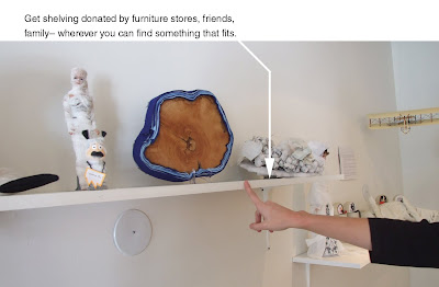
A while back I wrote a posting about the idea of the Denver Community Museum. Recently, I went to see it in person, and met with founder Jaime Kopke. I figured seeing it would be better than writing about it, so below are highlights in a "how to" format (in the hopes that it will serve as a point of inspiration). A more in-depth interview will be posted in coming weeks. For me, this had to be one of the most inspirational museum visits of 2008, and reinforced that easy-to-remember-not-always-easy-to-follow mantra K.I.S.S.:
Labels:
"denver community museum",
"maria mortati",
community,
curator,
museums
Wednesday, January 7, 2009
Bubble, Anyone?
The Paola Antonelli quote above was brought to me by Ron Davis, illustrious Principal here at Gyroscope. It's from an article in last Sunday's New York Times by Michael Cannell called "Design Loves a Depression". Mr. Cannell suggested that lean times equal less superfluous design which means better design. It's interesting... and lean. The the article and its design– the Eames chair positioned next to the Campana Brothers chair, and his website gave me the impression that he'd prefer all design to be mid-century minimalist (which I do enjoy). However, I believe the fantastic has a particularly useful role in design. It lifts us out of the every day, and gives us a sense of possibility. Which in these times, can be a very good thing. The problem hasn't been the overabundance of anti-utilitarian chairs, it's been the overabundance of cheap-but-nice-looking stuff. Mr. Cannell suggested that it's "the designer’s job to discourage consumers from regarding that $30 Ikea side table as a throwaway item." I'd regard it as permanent if it lasted longer, and I'd add to that and say it shouldn't be anyone's job to design a throwaway table. I bet the person that bought the Campana Brothers chair is not going to throw it away anytime soon-- or ever. As we continue to formalize our green practice with programs like the LEED certification, we find that it's not a "buy this over that" fix– it's an integrated approach to the entire project that makes things good and green. There are many designers who have been working long and hard to change design in this way. William McDonough + Co., who Mr. Cannell refers to, have been at it since 1981. It's only now that it's fashionable. While some in the mass-consumer design world have been creating a few too many transient objects, the museum world has had little in the way of excess. The impact of the economy on the museum industry has left many feeling that maybe a bubble is better. Especially if you're out of a job or closing down good public programs. Museums have always had to make more with less, with few exceptions. Tough time means that we will now work smarter... and harder.
Labels:
"maria mortati",
"New York Times",
culture,
design,
environment,
gyroscope,
museums
Monday, January 5, 2009
Gyroscope staff achieves LEED accreditation
Congratulations to Principal Maeryta Medrano and Designer Scott Moulton on our staff! They recently passed their LEED Professional Accreditation exam. This is the culmination of many late nights and long weekends of study. What is it? Read on from the USGBC/GBCI:
"LEED Accredited Professionals (LEED APs) are building industry professionals who have demonstrated a thorough understanding of green building and the LEED® Green Building Rating System™. The LEED AP credential indicates that the professional has the knowledge and skills to facilitate the LEED certification process."What does this mean for you? If you are working on a museum project and are looking to achieve LEED credits, we'll be able to provide in-depth info and resources on green building as it applies to musuems. We'll continue to post relevant info here on a weekly basis. We'll also continue to focus on current thinking and experiementation in the area of museums, the visitor experience, and planning. A lot to look forward to in 2009.
Subscribe to:
Posts (Atom)